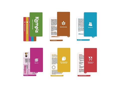
Kompis
“What influence can a single designer have on the development of sustainable design in today’s Norwegian consumer market?”
Through my bachelor thesis, I wanted to explore how individual designers approach sustainability and how much emphasis is placed on it. After conducting several interviews with design firms and freelancers, I found that many are actively engaged in sustainability and possess considerable knowledge. However, I also realized that information about sustainability and how to work with it, can often feel overwhelming and heavy.
To address this, I created a guide intended to make sustainability more accessible and easier to navigate. The content was simplified and condensed, making it relevant to a wider audience of designers: from employees at print shops and communication agencies, to students and design studios


"My goal was to create something that makes sustainability feel approachable and inspiring to work with something associated with joy, freedom, creativity, pushing boundaries, and having fun. The guide serves as a practical tool for everyday use: a support, a collaborator, or a reference point whenever needed. It can be used during meetings, discussions, or simply as a quick refresher. Its clear color-coded categories make it intuitive and easy to browse."

Color Palette Concept
The color palette is designed to inspire and make the guide easy to navigate. Bright, lively colors add a sense of joy and motivation to the work with sustainability, while different shades of each color create variety and keep the guide visually engaging.

Icon Design
The icons are created to clearly categorize the guide while also acting as a recognizable quality mark. They are designed to work seamlessly across platforms—digital or print—and remain easy to read from a distance. To ensure flexibility, they can be used in both positive and negative formats without losing impact.


Typography Choice
The body text is set in Aaux Next, a grotesque typeface characterized by open, rounded forms. It features a generous x-height and subtle curves on the terminals of both letters and numerals. These small details contribute to a refined appearance and provide strong visual structure without being distracting. To enhance readability and ensure the guide’s functionality, the typography is applied with variations in weight, size, and spacing.
Customizable Color Fan
Each category was carefully selected based on feedback from interviews and surveys. The guide is not meant to be read linearly from start to finish but rather accessed as needed.
The design resembles a color fan, bound at one end with an open-and-close mechanism that allows the pages to be rearranged or removed. This way, the guide can be adapted to individual needs—pages can be customized, reordered, or added, and then secured back in place with the screw mechanism.

Logo Representing Friendship and Sustainability
The word kompis (meaning “buddy” or “friend” in Norwegian) was chosen because it feels approachable, relaxed, and easy to connect with. It sets a friendly tone, adds a touch of humor, and communicates honesty and trust.
The logo design combines these values with a focus on sustainability. The letter “k” wraps around the “o”, symbolizing care and protection of the Earth. The round form of the “o” represents our planet, while the linked letters “m”, “p”, “i”, and “s” illustrate friendship and support - letters that literally hold each other together. The result is a visual identity that communicates both connection and responsibility in a simple, memorable way.


